Ethos
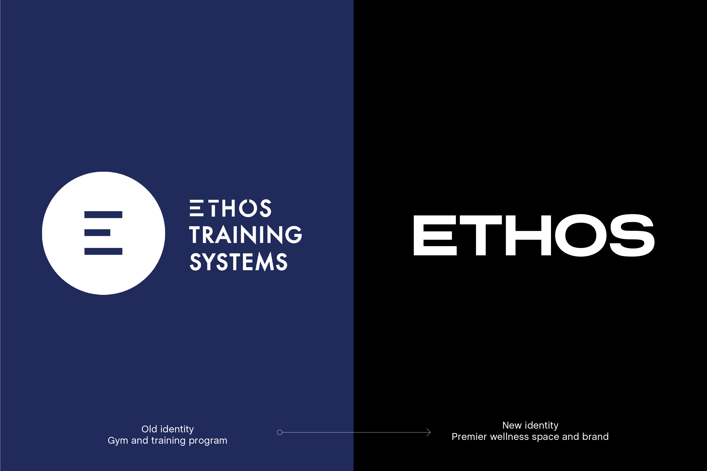
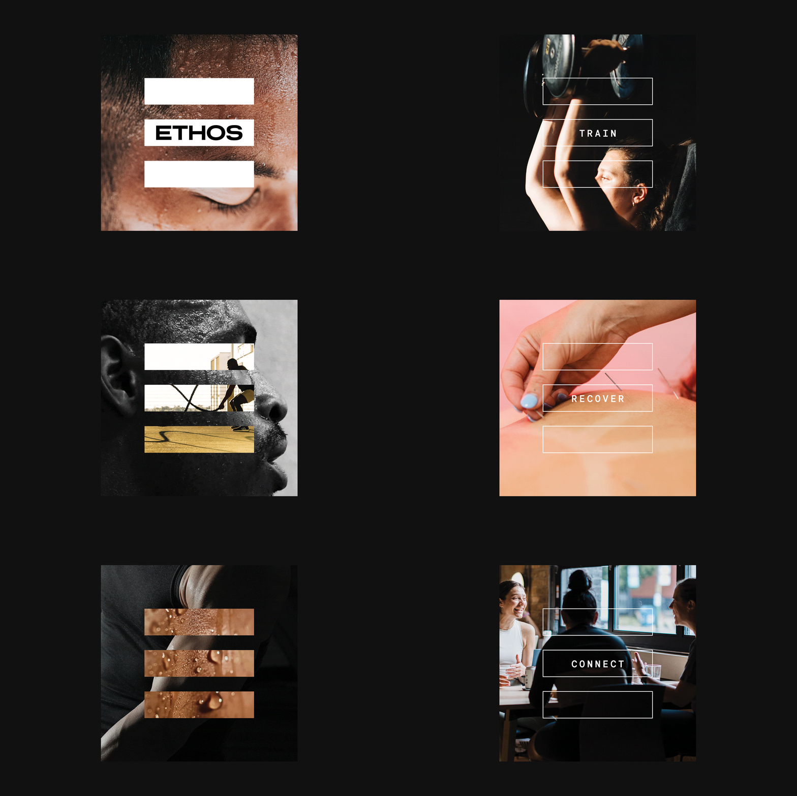
As Ethos transitioned from a high-intensity training gym to a broader wellness destination, we reimagined their visual identity to reflect that evolution. The new brand captures both strength and stillness—balancing bold typographic forms with a muted, bold palette. The updated visual brand positions Ethos as a modern wellness brand rooted in strength and community.
Services︎︎︎
Visual Brand Identity, Creative Strategy, Environmental graphics and wayfinding

Exterior Environmental Graphics
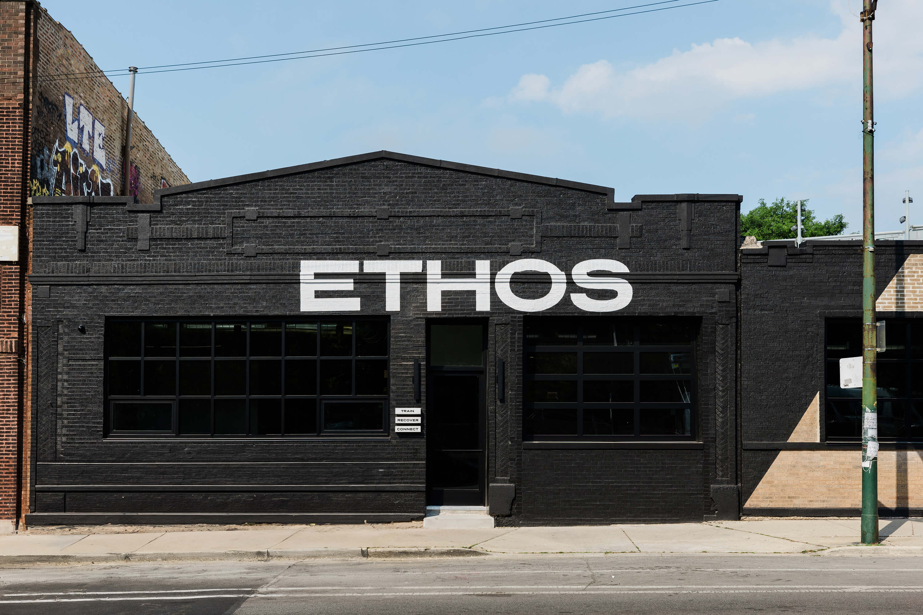
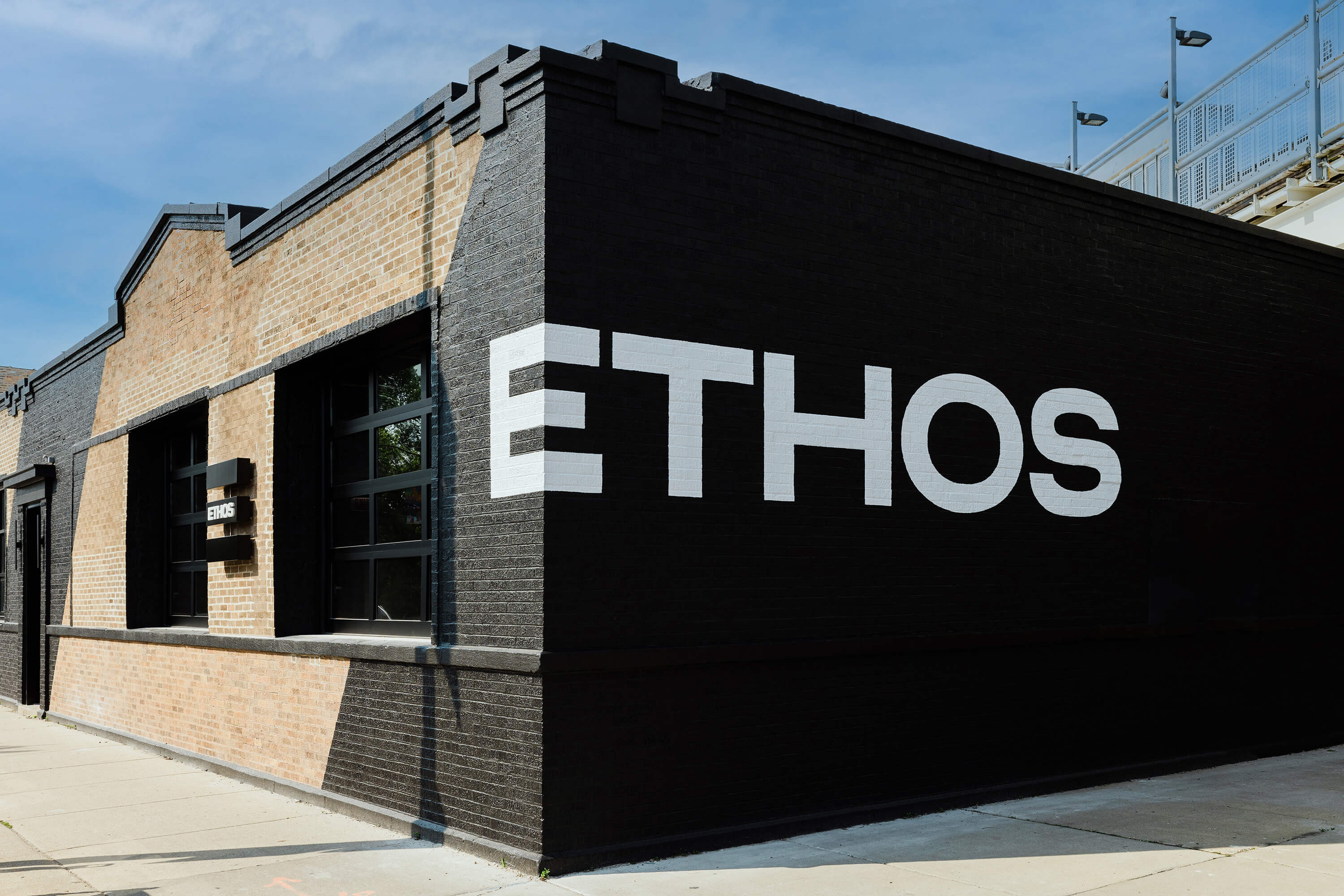
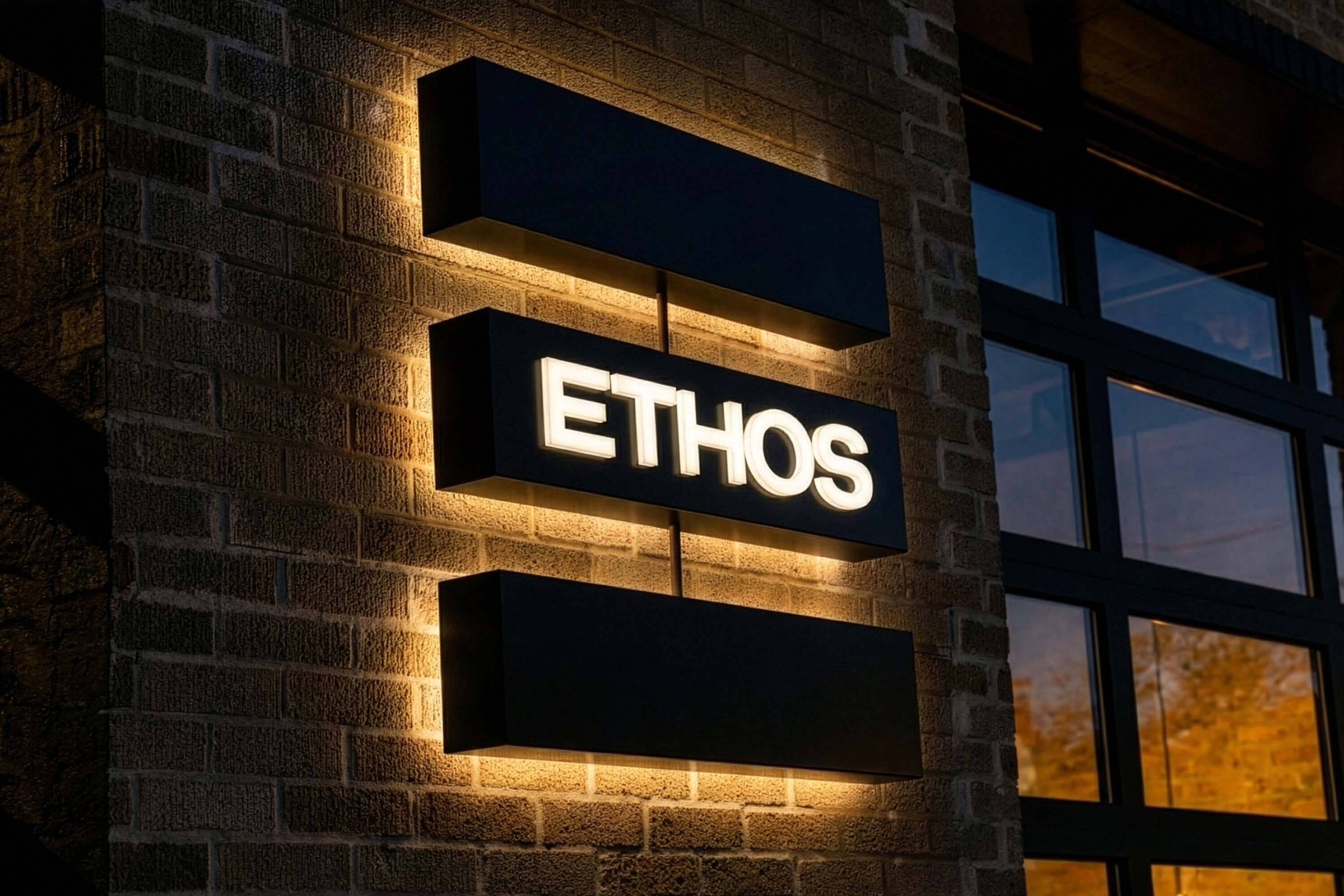
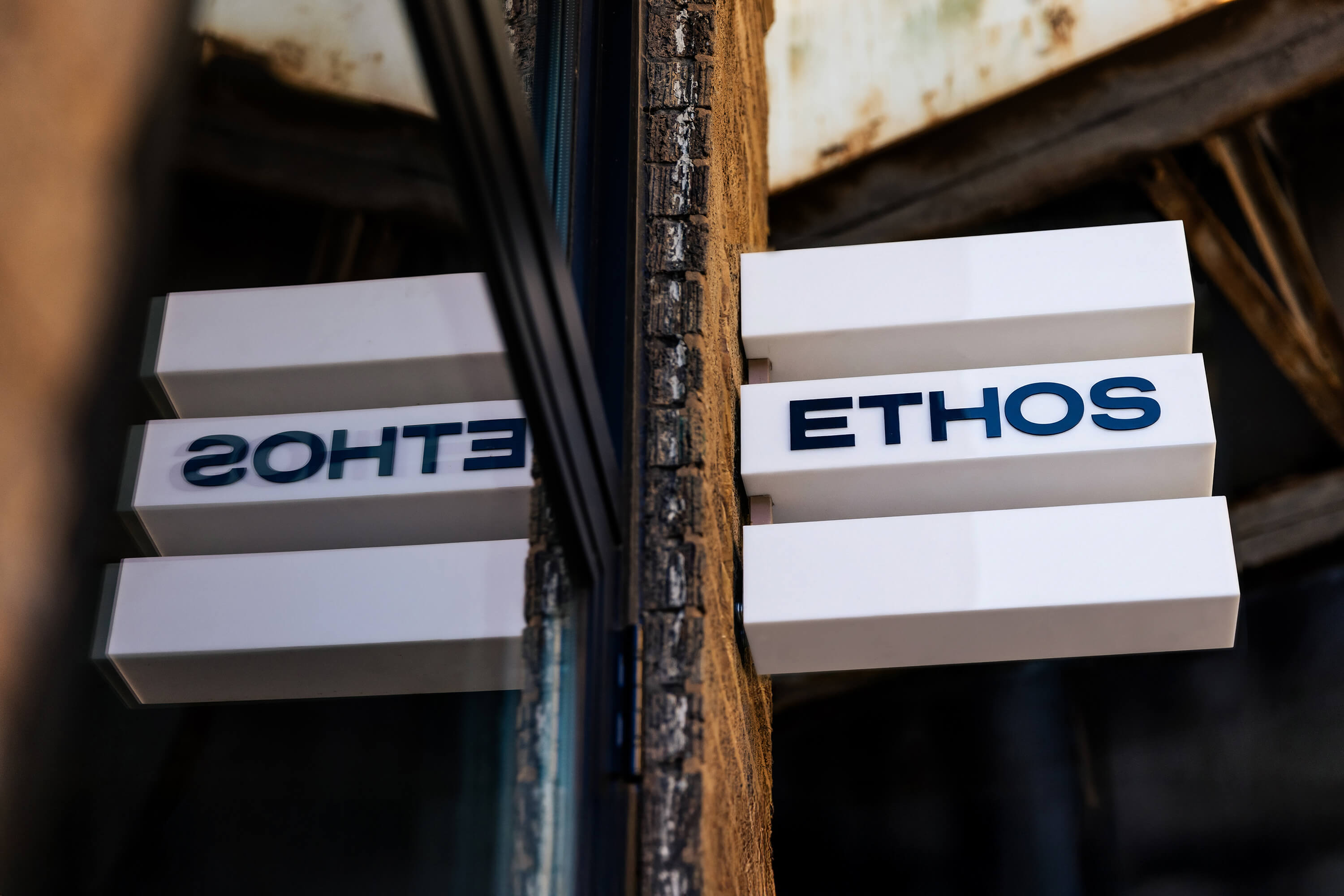
We rotated the three-stripe brand mark to unify a facade that once read as separate buildings. The ETHOS wordmark is enlarged in two moments — above the main entrance for clarity and on a high-visibility corner that guides people to the treatment-space entry. With clean, illuminated signage, the system stays functional and true to the brand’s stripped-back, high-contrast look. The result is an exterior that feels intentional, modern, and aligned with the architecture.
 A simple rotation of the three-stripe brand mark lines up across the facade and ties together what once felt like several separate buildings.