Second Generation
Second Generation is a new neighborhood bistro from an established group of Chicago restaurateurs. We worked with this team several years ago to help them create Mini Mott. Like many restaurants, Mini Mott pivoted to delivery and to-go during the pandemic. As in-person service began again, the Mini Mott team was craving a new direction with a strong community connection. That’s when they reached out to us once again.
Services︎︎︎ Strategy, Branding, Creative Direction, Graphic Design, Environments
This project began as a rebrand. The team wanted to give Mini Mott a slight new look and feel to match the new menu and service they were planning.
As we went down the road of discovery, it became clear there was an emotional and strategical need to create a whole new brand. That’s when Second Generation was born.
As we went down the road of discovery, it became clear there was an emotional and strategical need to create a whole new brand. That’s when Second Generation was born.
The result of our collaboration is a brand built from their hearts. Every touchpoint through the visual brand and space has a deep connection with the team. It is a visual, tangible represenation of the love and care they put into their food and service.
As the 2G team puts it: “...Second Generation resonates with the rich and layered identity of being raised in two cultures — both wholly American and wholly Asian —and what’s more American than being a child of immigrants.”
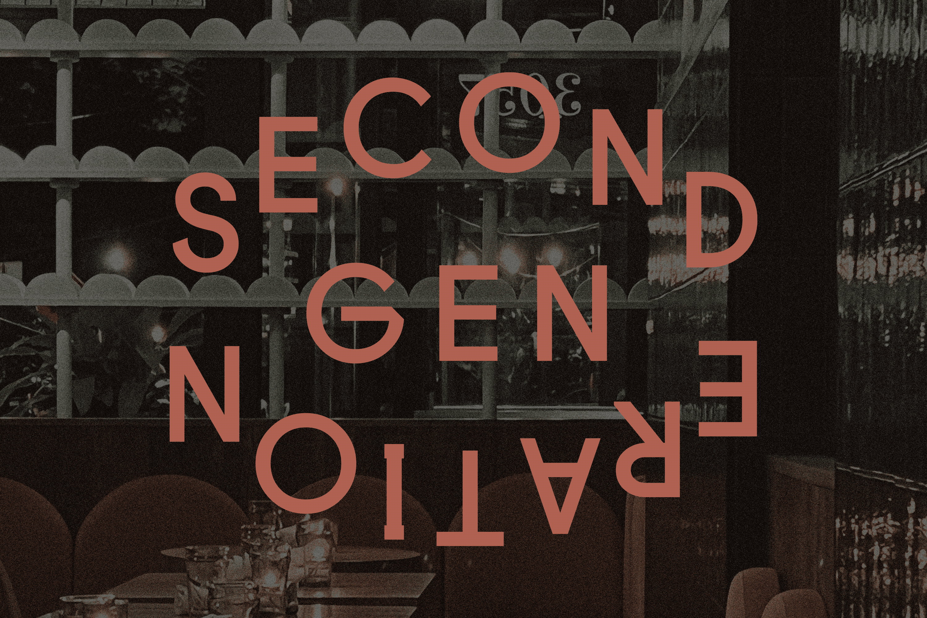
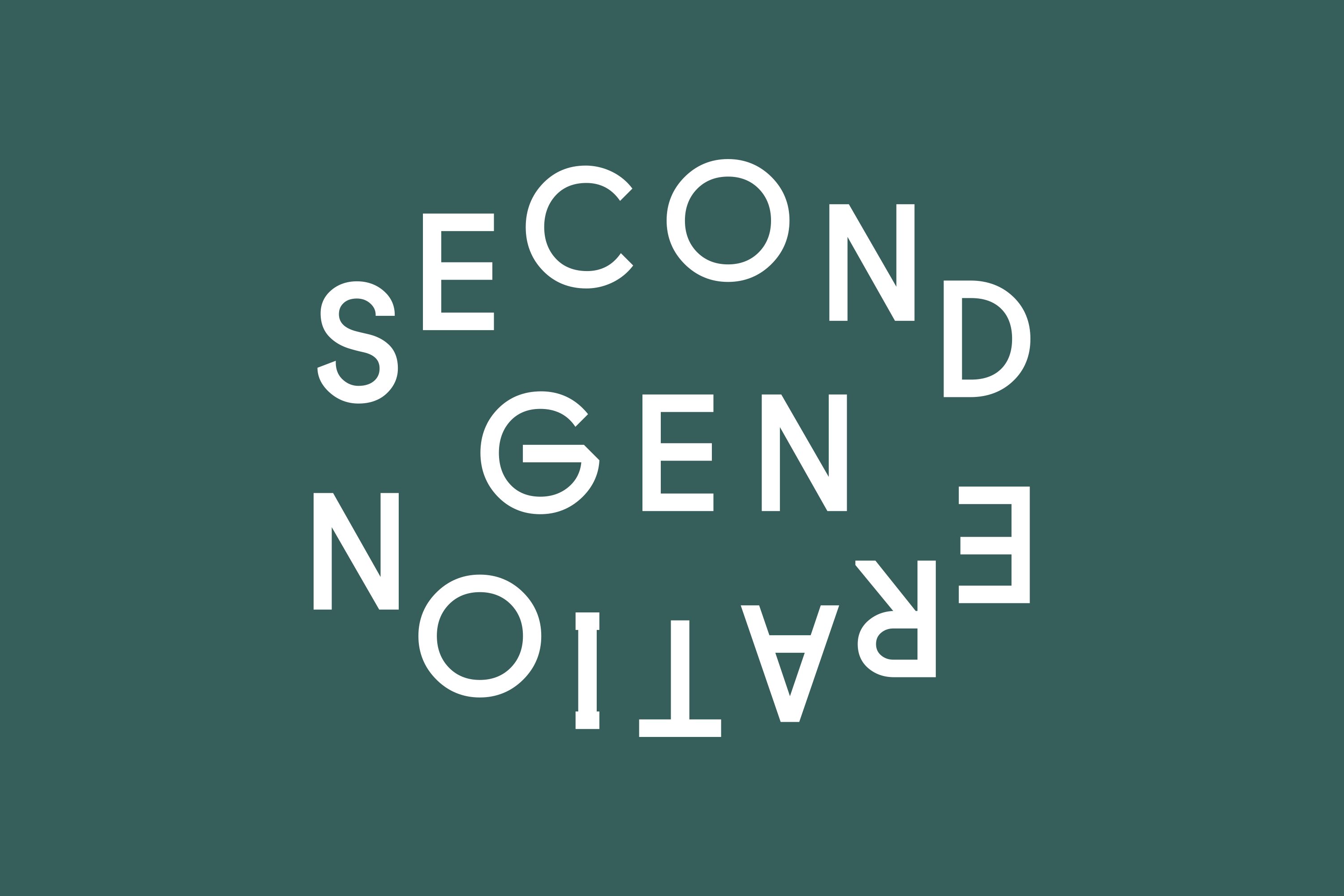
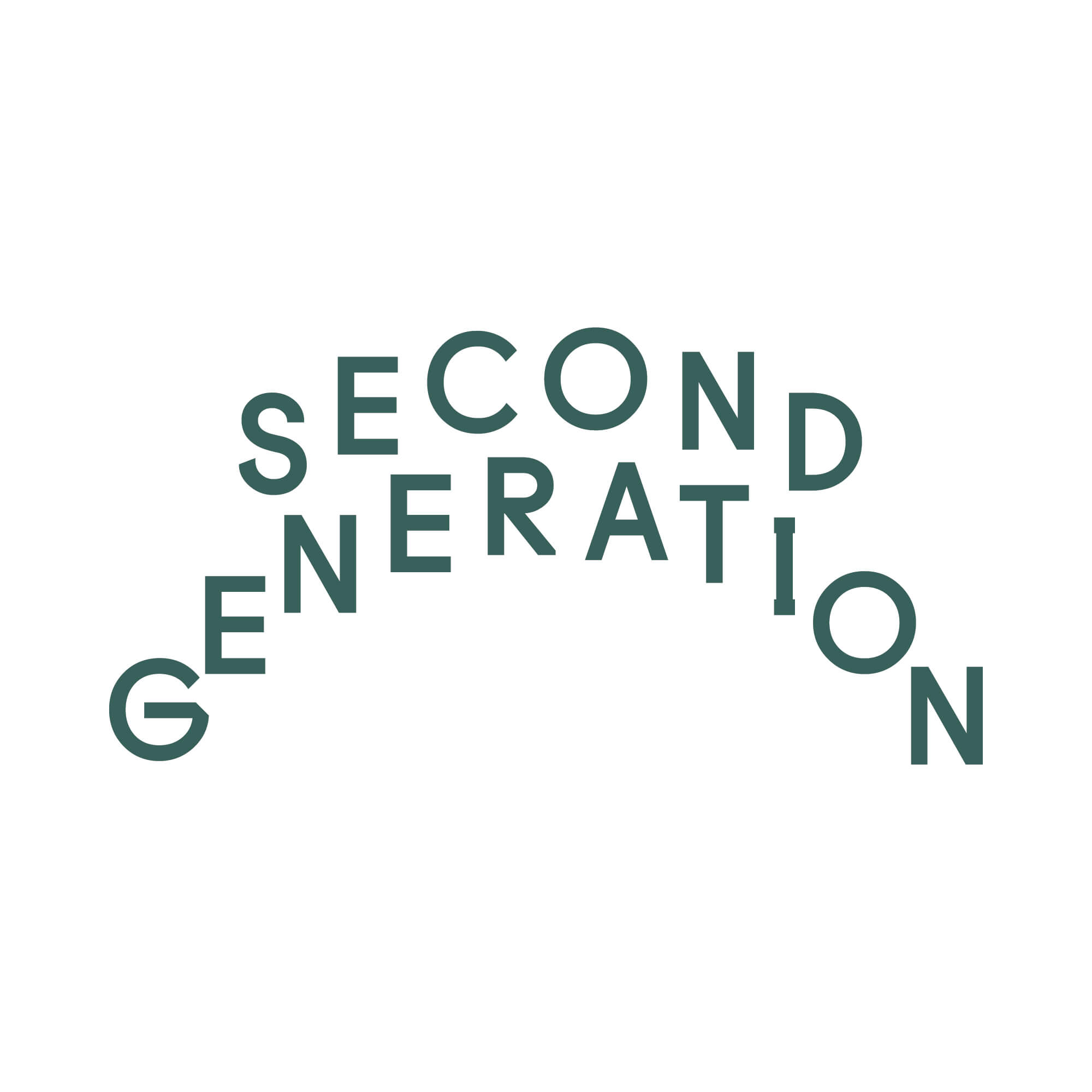
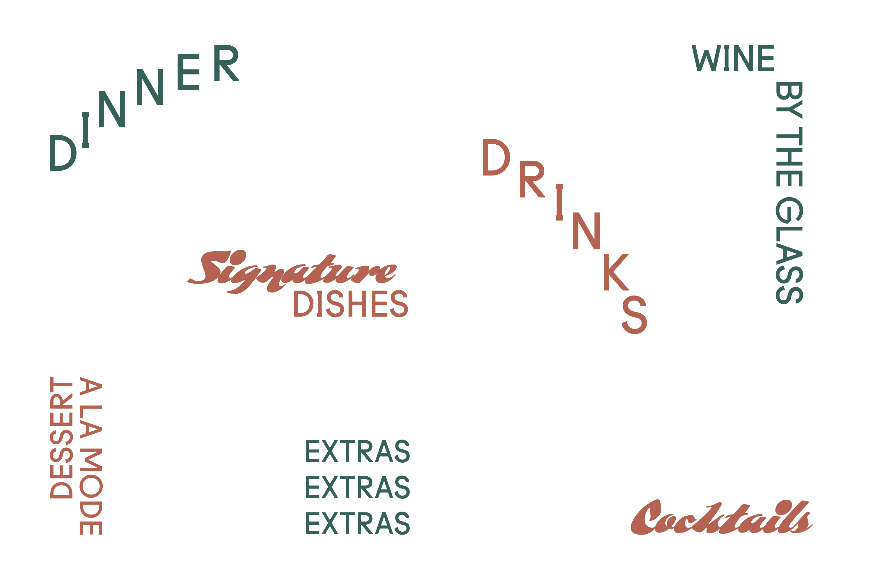
The visual idenity system consists of two expressive wordmarks and one icon mark. The primary wordmark is playful and familiar, but makes you take a second look--just like their food.
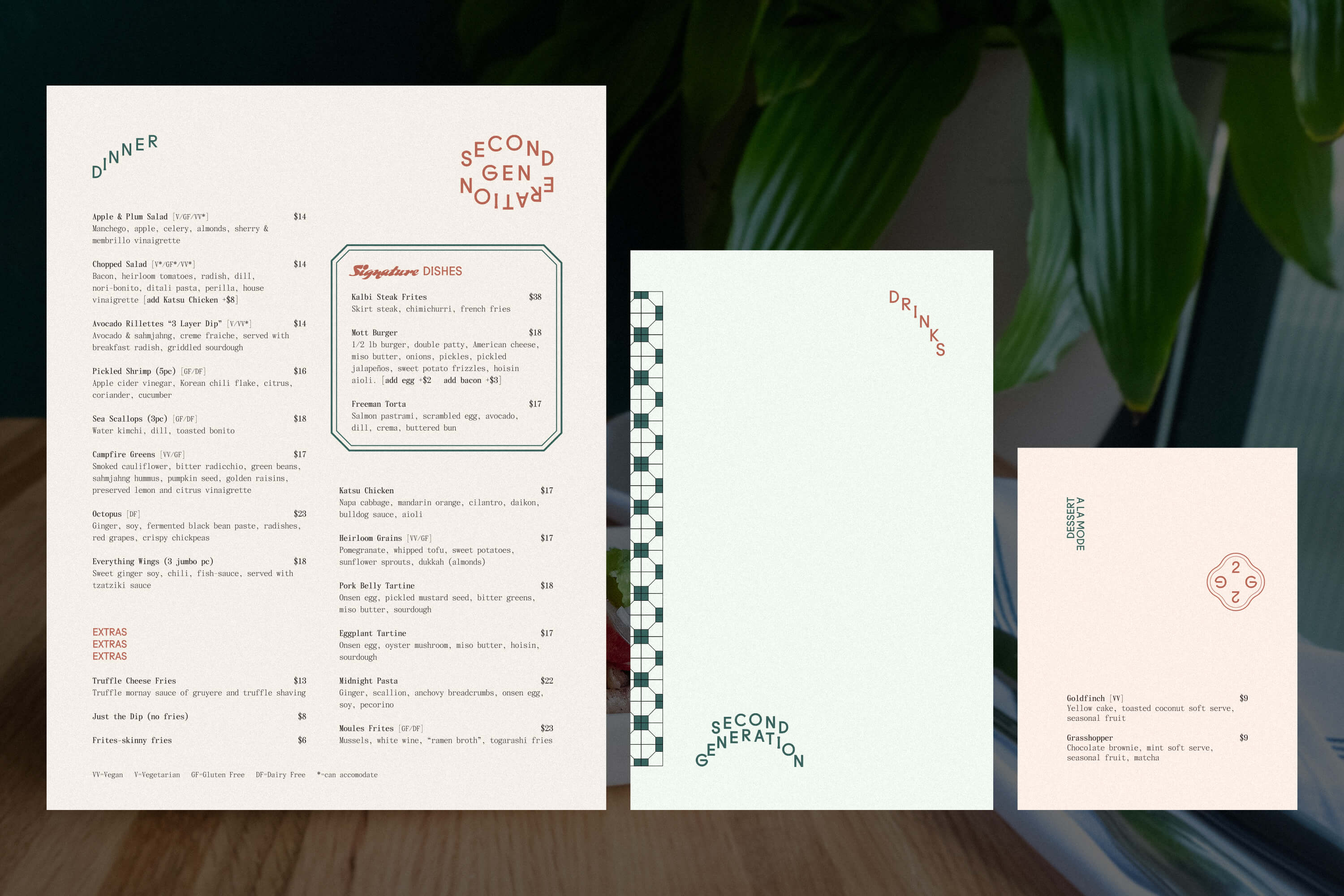
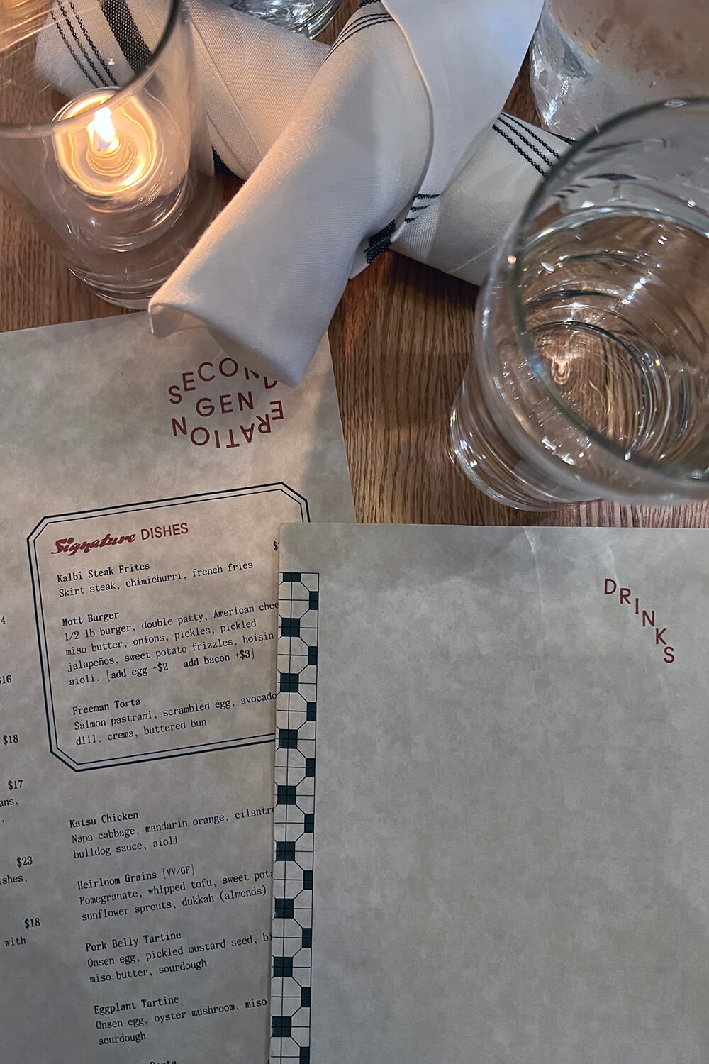
The menu system.
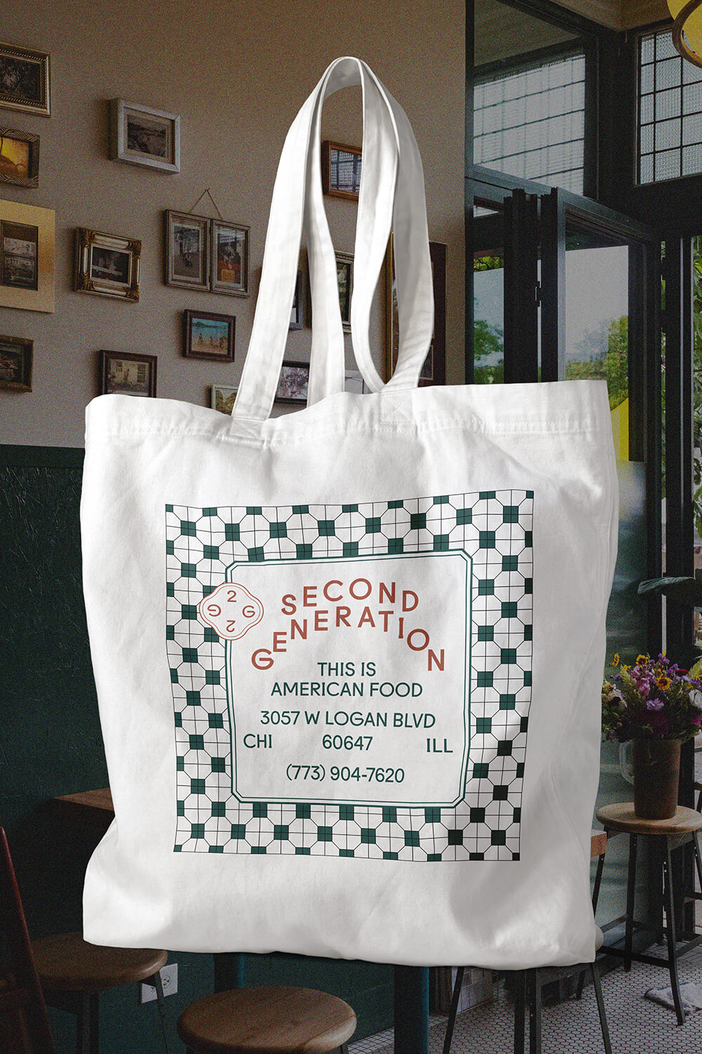
The message “American Food”, as seen on various touchpoints, is a simple and direct statement that speaks to their experiences growing up in American with dual cutlures.
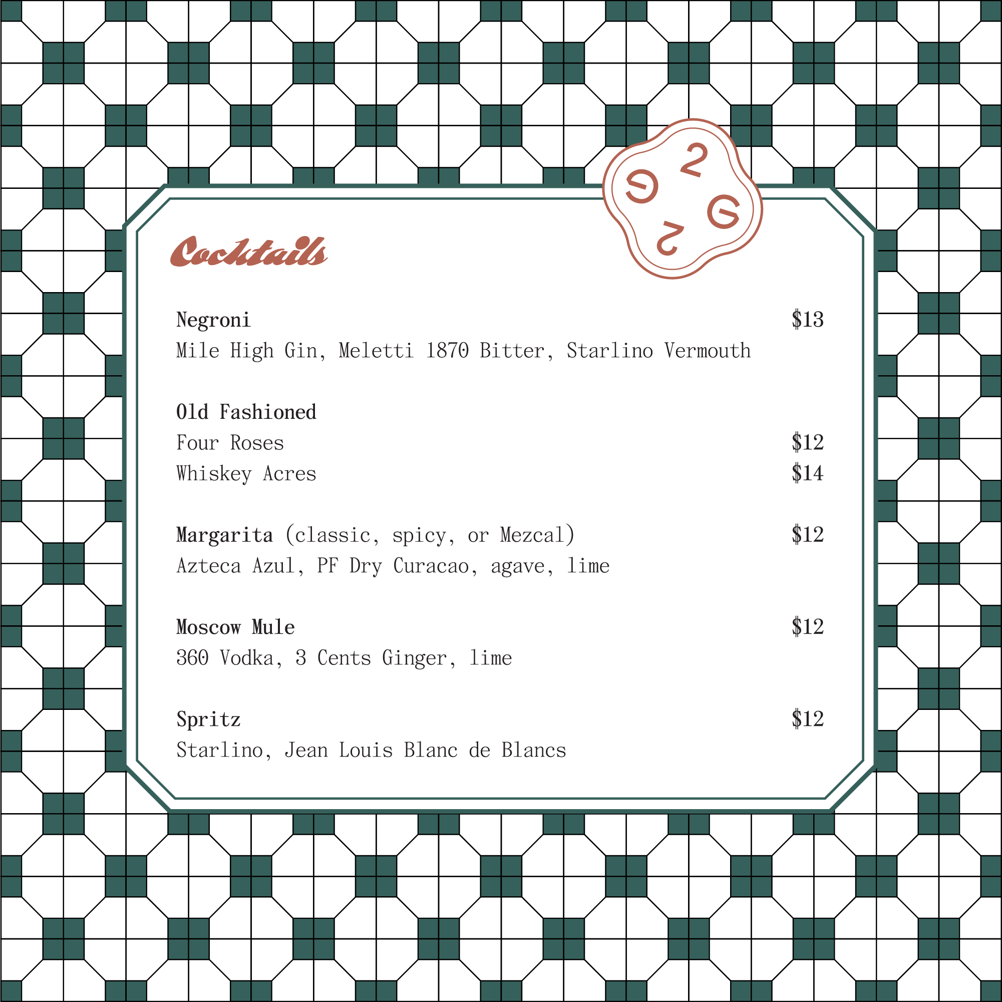
We created a graphic pattern, a reference to a classic tile used in Hong Kong. The borders around the text boxes connects to treatments used on some traditional Chinese restaurant menus. Lastly, the typography is a refernce to mid-century American supper clubs and cocktail lounges.
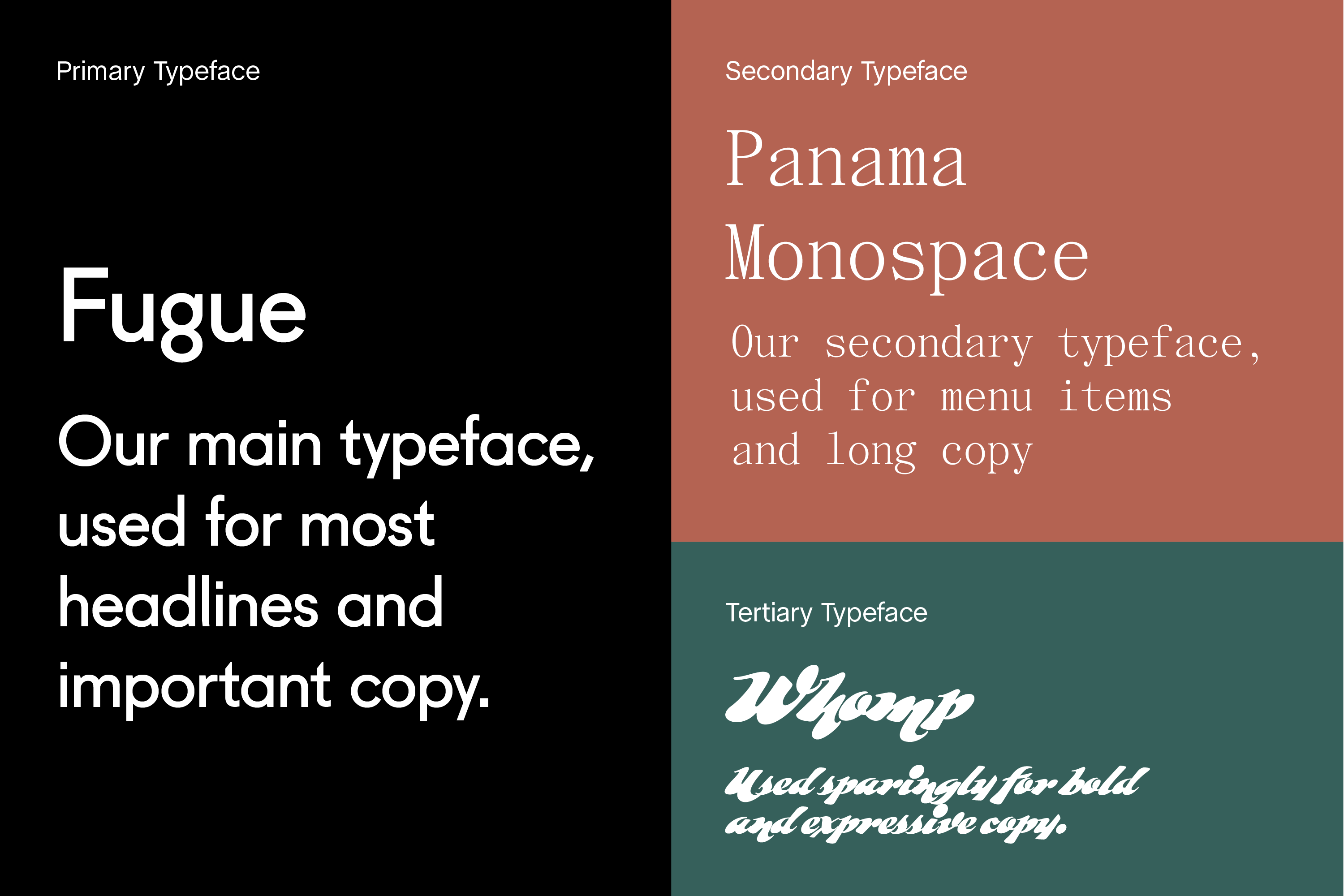
We created a type system that balanced legibility and expression, the past and the present.
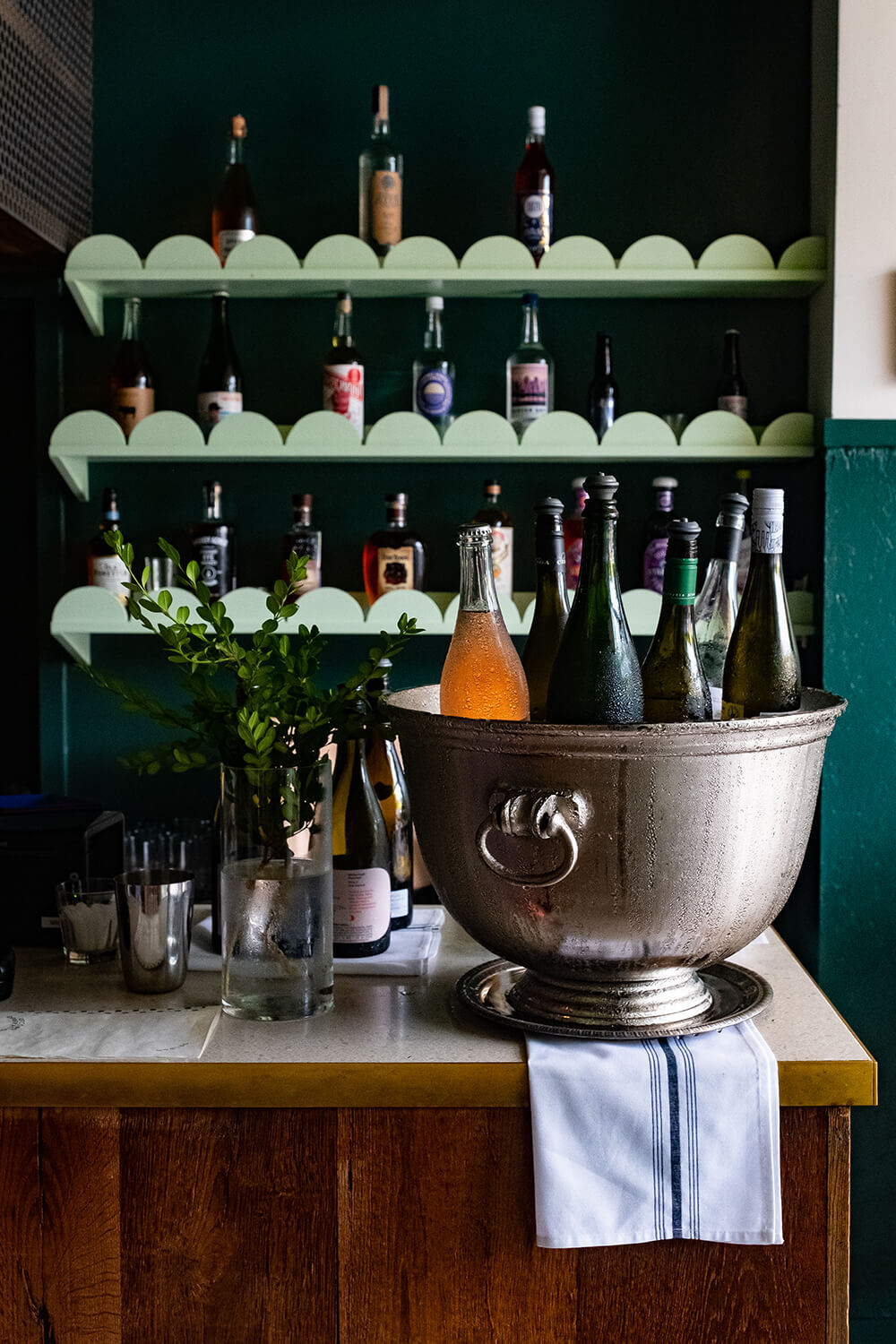
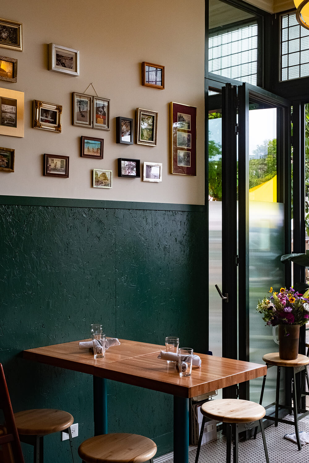
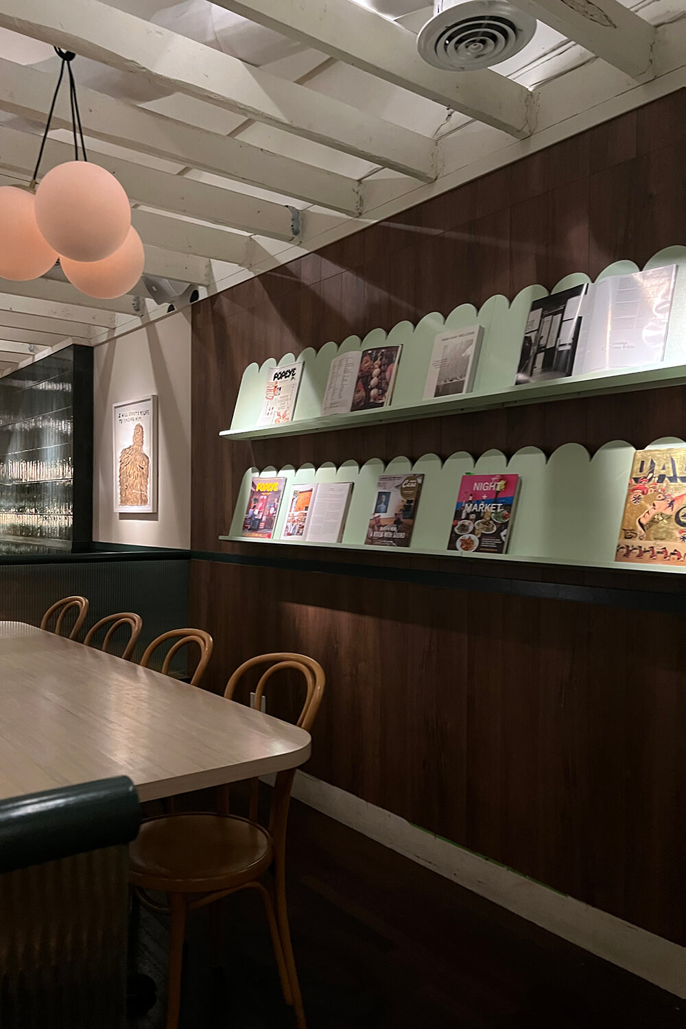
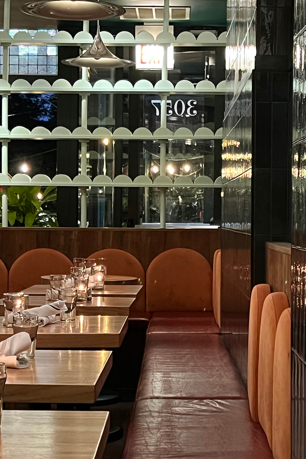
Partnering with the Second Generation team, we created an environment that felt moody, comfortable, and fresh.


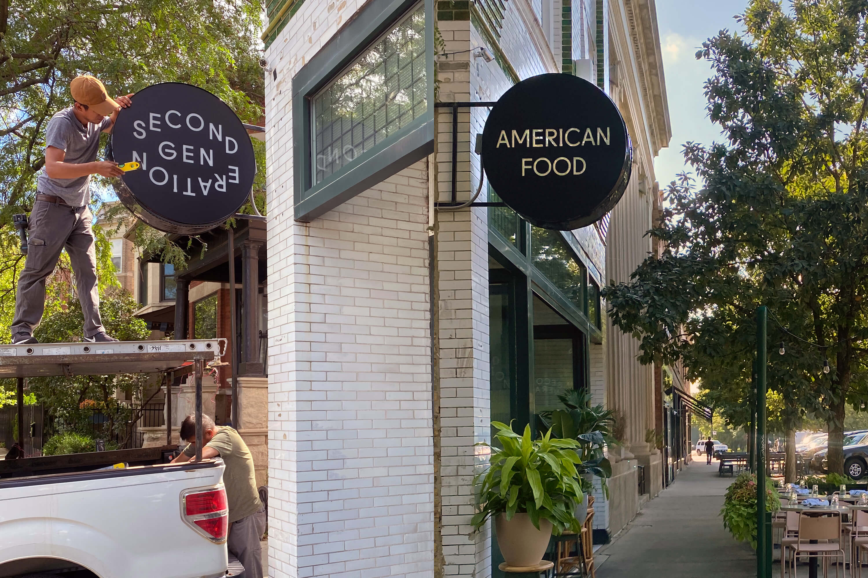
The exterior sign features the logo on one side and "American Food" on the other.